Meta ad creative in 2026: the formats that win, the sizes, and the rules
Meta's system finds the people. Your creative decides which people it finds. These are the formats, sizes and rules we use on live campaigns.
In short
- Meta's retrieval system matches ads to people by what the ad is, so ten different ideas reach more people than ten versions of one.
- Build every ad in the shape of its placement: 4:5 at 1440 × 1800 for the feed, 9:16 at 1440 × 2560 for Reels and Stories.
- On 9:16, keep the top 14%, the bottom 35% and 6% of each side clear of text and logos.
- Pick the job first (stop the scroll, show the difference, talk like a person, make them smile, give a reason to act), then the format.
- Most rejected creative breaks one of a few rules: drawn buttons, implied personal traits, false urgency and ads that pose as news or reviews.
Written from the Meta Ad Creative Book 2026 (Edition 01, September 2026). The examples are client work for PLB Snacks, shown with the client's permission.
What wins attention in 2026
Meta's system now does most of the targeting. Your creative decides who it finds, so different ideas reach different people.
- Step 1 · RetrievalWhich ads could fit?Meta's Andromeda system narrows millions of ads to a few thousand candidates for each person. Distinct ideas get more chances to go forward.
- Step 2 · AuctionWhich one wins?Meta weighs your bid, how likely this person is to act, and the ad's quality.
- Step 3 · DeliveryWhere it showsFeed, Reels or Stories. An ad made for its placement looks native there.
A variation is the same idea with a new colour, headline or crop. Meta's system can treat it as the same ad, so it reaches the same people. A new concept changes the person, the problem, the moment or the format, so it can find a different group, which is what retrieval rewards. An ad set holds up to 50 ads, but only distinct creatives move forward.
Meta and Nielsen both sell advertising or measurement, so read their figures as direction, not proof.
Specs and safe zones
Make every ad in the shape of its placement, and keep words where the app's buttons cannot cover them.
| Placement | Shape | Size | Know this |
|---|---|---|---|
| Feed image, Facebook and Instagram | 4:5 | 1440 × 1800 | JPG or PNG, up to 30 MB. Primary text 50–150 characters, headline 27 |
| Stories and Reels image | 9:16 | 1440 × 2560 | Keep the top 14%, the bottom 35% and 6% of each side clear |
| Reels video | 9:16 | 1440 × 2560 | Sound strongly recommended, captions recommended |
| Instagram Feed carousel | 4:5, or 1:1 with video | at least 1080 × 1080 | 2 to 10 cards; one ratio for every card |
On a 1440 × 2560 frame, the safe zone leaves about 358 px clear at the top, 896 px at the bottom and 86 px on each side. Placements that show square ads centre-crop a 4:5 image, so the eyebrow line and logo at the top and the offer at the bottom are the first things lost. Of 205 ads we built at 4:5 for one brand, 199 lost content at the top and 184 at the bottom in a 1:1 crop. Keep key content in the middle square, or make a 1:1 version with the type reflowed.
Award winners, taken apart
Seven Cannes Lions Grand Prix winners from 2024 to 2026, each reduced to the one idea a smaller brand can use. Borrow the principle, never the ad.
- CeraVe, Michael CeraVe (2024, Social and Influencer). Creators spread a playful rumour that the actor Michael Cera had created CeraVe; the brand's Super Bowl ad settled it: dermatologists did. Take this: let people wonder aloud, then answer with your product's real story.
- Heinz, It Has To Be Heinz (2024, Creative Effectiveness). Five years of work on one line, from people drawing Heinz when asked to draw ketchup to the right pouring angle. Take this: one line, many small executions, kept for years.
- Vaseline Verified (2025, Social and Creator). Vaseline lab-tested viral creator hacks that used its jelly; the ones that worked earned a badge, the unsafe ones were called out. Take this: join what customers already say about you, and add proof.
- Apple, Shot on iPhone (2025, Creative Effectiveness). Customers' own iPhone photos have been the ads since 2015. Take this: make what customers create with your product the demo.
- Indian Railways, Lucky Yatra (2025, PR). Every paid ticket became a lucky-draw entry, with no app or extra step, to cut ticketless travel. Take this: reward the behaviour you want, and ask for no extra effort.
- Heineken, Could Have Been a Heineken (2026, Social and Creator). Forward a long WhatsApp voice note to a Heineken bot and get an offer to say it in person instead. Take this: build on a small, shared annoyance, inside the app where it happens.
- AXA, Three Words (2026, Creative Effectiveness). AXA added "and domestic violence" to a policy clause, so survivors can leave a housing contract without penalty. Take this: change the product first, then advertise the change.
Each one can be told in a sentence, rests on a real truth about the product or its buyers, and gives people something to do, say or share. None of them depends on a clever layout.
Pick the job, then the format
Every ad has one job in the feed. Choose the job from what you need to happen, then pick a format that does it.
| Your goal | The job | Formats to test first | Judge it on |
|---|---|---|---|
| Launch a product | Stop the scroll | Breaking news, In case of emergency, The warning | Thumb-stop rate, link CTR |
| Win people who use a rival | Show the difference | Us versus them, Then and now | Link CTR, cost per purchase |
| Reach people tired of ads | Talk like a person | Text message, Green-screen reaction | Hold rate, comments |
| Earn shares and affection | Make them smile | Don't buy this, Known side effects | Shares, saves |
| Convert warm audiences | Give a reason to act | The offer, Myth versus fact | Purchases, cost per result |
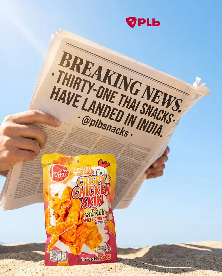
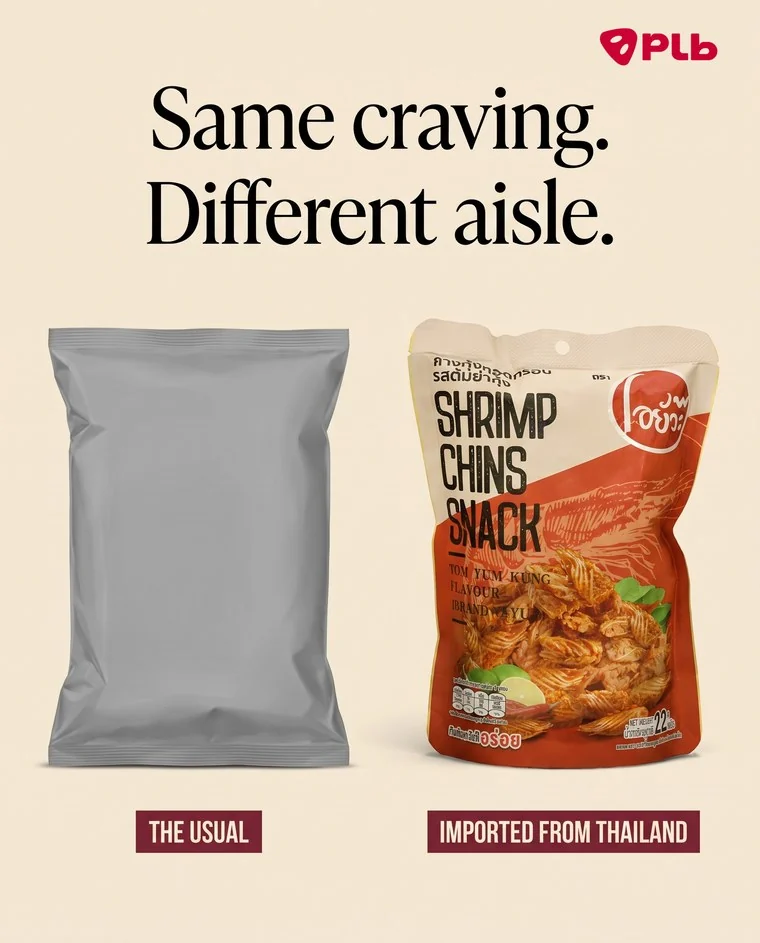
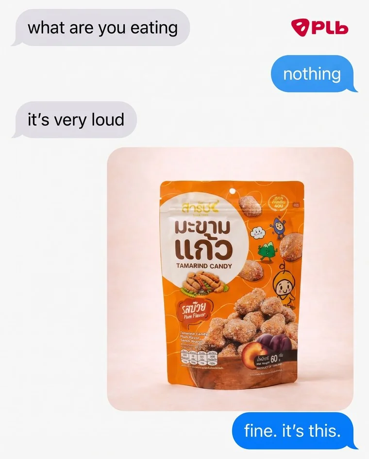
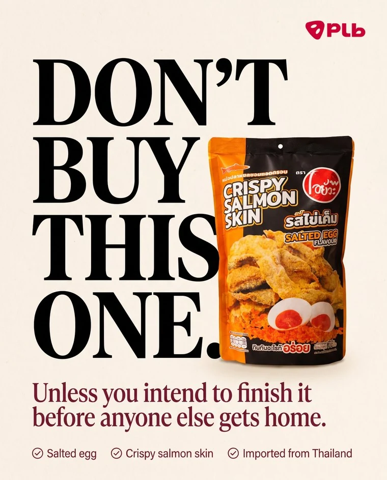
Client work · PLB Snacks · Meta feed, 4:5. Cold audiences, people who do not know you yet, need the first two jobs. Warm audiences need the middle two. People close to buying need a reason to act.
Carousels that get swiped
A carousel is one story told in five cards. Every card has to earn the next swipe.
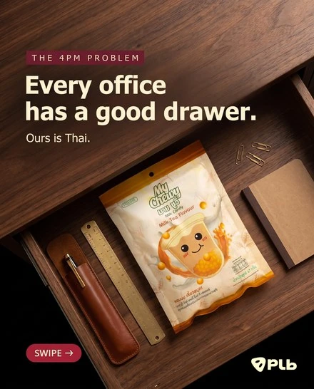
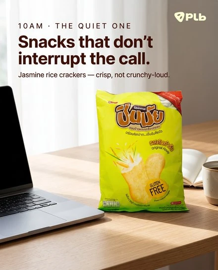
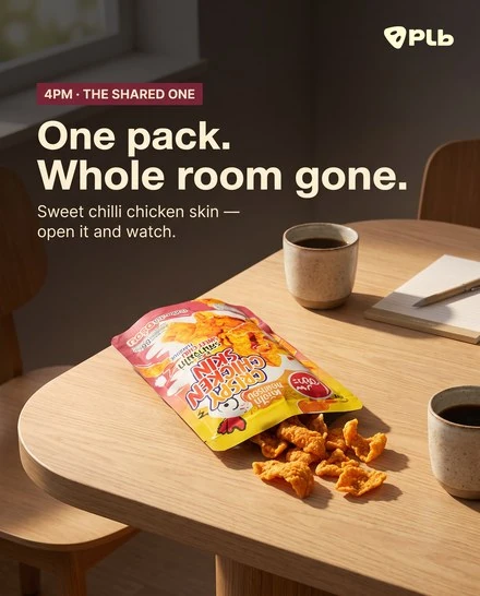
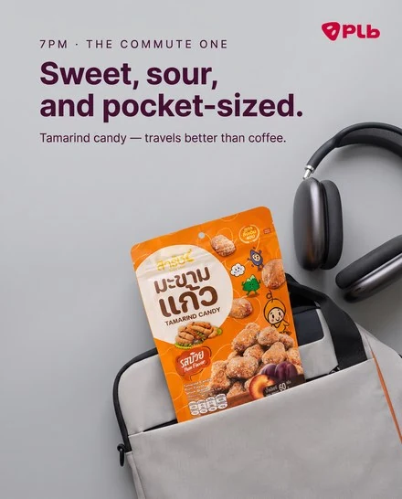
Client work · PLB Snacks · a day in the office, told in five cards. The fifth card closes with the offer.
- Card 1 sells the swipe. A promise or a question, plus a visible swipe cue. It has to work alone, because many people see only card 1.
- Each card sets up the next. Here the clock moves forward, so the reader wants the next hour. If two cards could swap places, the story is too loose.
- One product per card. One pack and one specific line: "crisp, not crunchy-loud" beats "delicious and crunchy".
- The last card closes. Pay off the promise from card 1, then give one action: a code, a link, or a question to answer in the comments.
| Spine | Card 1 | Cards 2 to 4 | Card 5 |
|---|---|---|---|
| A day in the life | The problem, at a time of day | Three moments, in order | The fix, then the offer |
| Field guide | Which one are you? | One type per card | All of them in one box |
| Ranking | We ranked them | From mild to wild | The top pick, then the offer |
| Myth list | Three things people believe | One myth and its truth per card | What to do instead |
| Build a box | Build your own | Pick one, pick two, pick three | Your box and the code |
Reels and Stories ads that hold
Vertical, sound on, and the point made before the thumb moves on. A 15-second storyboard:
- 0–1 sThe hookMovement and the problem, in one frame.
- 1–3 sThe promiseThe product appears, and is named.
- 3–10 sThe proofUse it, show the texture, show a real reaction.
- 10–15 sThe askThe offer and one action, inside the safe area.
Shoot vertical at 1440 × 2560: a 16:9 video with bars looks like an ad from somewhere else. Meta calls sound "strongly recommended" on Reels and captions "recommended". Keep anything important out of the top 14% and the bottom 35%, where the app's text and buttons sit.
| Opening | The first frame shows | An example line |
|---|---|---|
| The problem | The mess, the queue, the empty drawer | "Your snack drawer has given up." |
| The pattern break | An object where it should not be | A pack behind emergency glass |
| The question | A face, looking at the camera | "What kind of crunch are you?" |
| The result first | The after, then how you got there | "Same bowl, ten minutes apart." |
| The opposite | A line no ad would say | "Don't buy this one." |
| The inside view | Hands, a kitchen, the making of it | "Here is what goes in first." |
Rules that keep ads live
Most rejected creative breaks one of a few rules. Imitation formats, false urgency and borrowed stars are where brands slip.
| Rule | What it means for your creative |
|---|---|
| Nonexistent functionality (Meta) | No drawn play buttons, notification badges or checkboxes that do nothing when tapped |
| Personal attributes (Meta) | Do not assert or imply the viewer's health, age, religion, money or identity. Meta allows "Meet seniors" but not "Meet other seniors" |
| Health and wellness (Meta) | Weight-loss, supplement and cosmetic ads target 18+, never run down how people look, never promise a set result by a set date |
| False urgency (CCPA, India) | Scarcity and popularity must be true. "Low stock" only while it is true, and specific |
| Disguised advertisement (CCPA, India) | An ad must not pose as a user's review, a post or a news article to win the click |
| Truthful claims (ASCI) | Claims must be true and backed; cited research needs its source and date |
| Influencer labels (ASCI) | Paid, gifted or partnership content carries a clear "Ad" or "Sponsored" label |
Showing another brand's marks needs its permission. Trustpilot lets businesses show its stars in ads only on a paid plan, and Google's interface or logo needs Google's permission: draw your own search bar, with no logo. In the US, the FTC rule in force since 21 October 2024 bans fake or AI-made reviewers and bought reviews.
Test and read your creative
Test ideas, not colours. Run three to five concepts at once, each a different job, person or format, and make each concept two or three ways: if both executions win, the idea works. Hold the budget, audience and offer still while you test.
| Number | How to work it out | What it tells you |
|---|---|---|
| Thumb-stop rate | 3-second video plays ÷ impressions | Whether the first second stops people |
| Hold rate | ThruPlays ÷ 3-second video plays | Whether the story keeps them |
| Link CTR | Link clicks ÷ impressions | Whether the ad makes people want to know more |
| Cost per result | Spend ÷ results | Whether it pays: the number that decides |
Thumb-stop and hold rates are working definitions media buyers use, not columns Meta names. Compare them between your own ads, never against someone else's account.
Signs an ad is tired
Frequency rises while link CTR falls, week after week. Cost per result creeps up. The same comments repeat.
What to do
Launch a new concept built on what made it win: the hook, the person or the format. A new colour on a tired idea keeps the tired idea.
A brief that fits on one page
A good brief answers eight questions. A designer, a creator or Claude can turn it into ads without guessing.
- Goal. What should change: sales, sign-ups, first orders. One goal only.
- Audience moment. Who they are, where they are, and what they feel when the ad appears.
- The one thing. The single message, in under 12 words.
- Proof. The fact that makes it believable: real, current, with permission.
- Job and format. The job, the format, the placement and the size.
- Must include. The official logo, real product photos, legal lines.
- Offer and action. The code, the link, or the reply you want.
- Success. The metric, the number to beat, and when you will judge it.
Give me 10 ad concepts for <product>, for <audience>. A concept is a
new idea, not a new colour or headline. Across the 10, change at least
one of: the person in the ad, the problem, the moment, or the format.
For each concept:
- Name (3 words)
- The job: stop the scroll, show the difference, talk like a person,
  make them smile, or give a reason to act
- The format (text message, us versus them, myth versus fact...)
- Headline on the image (under 8 words)
- What the image shows, in one sentence
- Who it is for, and why they would stop
Then mark the 3 most different from each other and say why. Invent no
reviews, numbers or claims: write <NEED PROOF> where one is needed.
The PDF has nine more prompts: a brief writer, twenty hooks for the first second, a format picker, a static writer, a carousel storyboard, a policy pre-check, a weekly results reader, an image prompt that protects the real product, and one that turns a winner into six new concepts.
Questions people ask
What size should Instagram feed ads be in 2026?
4:5 at 1440 × 1800 for feed images. Reels and Stories use 9:16 at 1440 × 2560, with the top 14%, the bottom 35% and 6% of each side kept clear of text.
Do near-identical versions of an ad help on Meta?
Rarely. Meta's retrieval system can treat ads that look alike as one creative, so they reach the same people. A new angle, person, moment or format is what reaches new people.
Is there still a 20% text limit on Meta ads?
No. Meta dropped the 20% text rule in September 2020. Heavy text is allowed, but it has to stay readable on a phone held at arm's length.
What gets ad creative rejected most often?
Drawn buttons and badges that do nothing when tapped, copy that implies the viewer's personal traits, health claims, false urgency, and ads that pose as news or as a customer's review.
How many cards should a carousel ad have?
Meta allows 2 to 10. Five leaves room for a hook, three steps and a close, and every card in one carousel shares a ratio: 4:5 when every card is an image, 1:1 once one card is a video.
Sources
- Meta Engineering: Andromeda (2 December 2024)
- Meta for Business: The creative advantage (22 April 2025); Demystifying creative diversification (16 December 2025); Reels ads, 15 split tests, May 2022 to April 2023
- Meta Ads Guide: Facebook Feed image, Instagram Reels video, Instagram Feed carousel (read 30 September 2026)
- Meta Transparency Center and Business Help: personal attributes, health and wellness, nonexistent functionality, AI info labels, ad limits
- Nielsen (NCSolutions), creative contribution to sales, October 2017
- Cannes Lions 2024 to 2026 coverage in Ad Age, Contagious, WARC, Adweek, Campaign and Social Samosa
- CCPA Guidelines for Prevention and Regulation of Dark Patterns (2023); ASCI Code and influencer guidelines (14 June 2021); US FTC rule on fake reviews (in force 21 October 2024)
Facts checked on 30 September 2026. Platforms change often: check the date on any setting before you rely on it.
Keep it
Download the Meta Ad Creative Book
Twenty-five real formats, two carousels taken apart card by card, seven award winners, the brief template and ten prompts, laid out for printing.
Download the PDFRather have us run it?
Start with a free sample ad
We make and run Meta ads, content and websites for food and consumer brands. For PLB Snacks: 3.16x return on Meta ads, April to October 2025.

Written by
Anisha Dogra
Anisha runs performance marketing and AI systems for brands at RAAY Creative, the AI Lab and marketing studio she co-founded in New Delhi. She writes these guides from the work the studio does every week, and checks every fact against its source before it goes up.
Talk to us about this